- Bariz
-
Website Design
Seo
Hosting
- Buy a ready-made website
- Online photo editor
-

A well-designed website can significantly boost a business—helping attract customers, increase sales, and grow revenue. If you want a professional and effective website, it's essential to know what type of design suits your business best. In this article, we’ll explain website design and introduce some of the most popular website design styles and layouts.
Website design refers to the process of creating and developing a website for the internet. While building a site requires other skills and tools such as coding and development, the design aspect mainly focuses on the appearance and user experience.
User experience includes the site’s layout, functionality, and content structure. A website designer aims to present information in the best possible way to make navigation easier for visitors. To achieve this, designers use various design styles and layouts depending on the site’s purpose and type.
When is a single-page website useful?
For product promotion, where the brand story unfolds as users scroll.
For artists and portfolios, providing an engaging way to showcase work on a single page.
2. Static Website
A static website is simple, with minimal user interaction. It is designed to look the same across all devices and is typically built using basic coding languages like HTML and CSS. Static websites have fixed pages and are cost-effective, but they are not ideal for e-commerce or interactive features.
When is a static website useful?
For corporate sites displaying contact details and company information.
For news sites or simple blogs that don’t require much user engagement.
3. Dynamic Website
Unlike static websites, dynamic websites allow user interaction—such as comments, form submissions, and product customization. They are built using programming languages like JavaScript, PHP, or ASP.
Key features of dynamic websites:
More complex design with additional functionalities.
Higher development costs and slightly slower loading times.
More engaging user experience with options for online services or e-commerce.
When is a dynamic website useful?
For online stores that need shopping carts and interactive features.
For social networks where users engage with content.
For educational websites offering interactive courses.
4. Responsive Design
Responsive design ensures that a website adapts to different screen sizes. Whether users open the site on a mobile device or a desktop, the content adjusts automatically to fit the screen. This approach enhances accessibility and usability across devices.
5. Liquid Design
Liquid design is similar to responsive design but does not change the layout. Instead, it stretches or shrinks the entire page to fit the screen size. While this method prevents content from being hidden, it may affect readability if stretched too much.
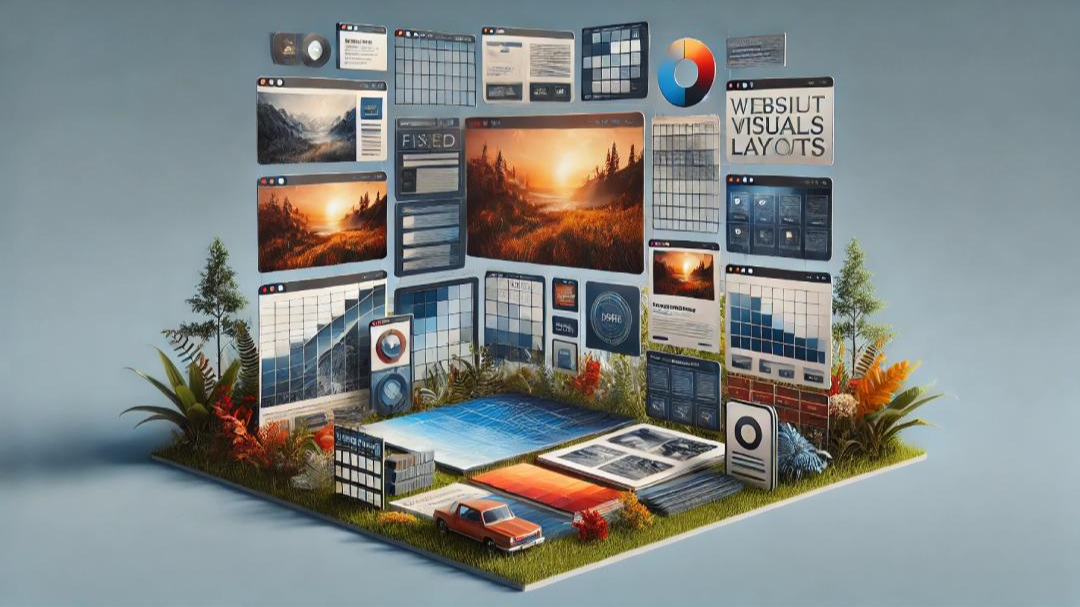
6. Fixed Design
Fixed design websites have a set width that doesn’t change based on screen size. This allows for precise layout control but can create issues for users on smaller screens, requiring excessive scrolling.
Here are some common website layouts and their best uses:
1. F-Shape Layout
This layout follows the natural reading pattern of users, where their eyes move in an "F" or "E" shape across the page. Websites using this layout effectively capture attention.
Best for:
News sites with multiple headlines and links.
Search engines, where users scan and select from a list of options.
2. Z-Shape Layout
Similar to the F-shape layout, the Z-shape layout targets a different reading pattern. Western audiences often scan pages in a “Z” pattern, making this layout ideal for websites with a specific goal, such as selling a product or encouraging sign-ups.
Best for:
E-commerce websites, where users are guided toward making a purchase.
Landing pages, designed to capture leads or direct users to key actions.
3. Grid of Cards Layout
This layout presents content in an organized grid that adjusts based on screen size. Many video streaming sites use this method to display thumbnails in a structured way.
Best for:
Video platforms like YouTube and Netflix.
Online stores, displaying products in a grid format.
Blogs and portfolios, showcasing multiple posts or projects.
4. Boxed Layout
In this layout, a large box at the top of the page contains a prominent image or text, with two smaller boxes below providing additional information or links to other sections.
Best for:
Artistic portfolios, displaying creative work.
Businesses, highlighting featured products or services.
5. Split Screen Layout
This design divides the website into two equal sections, allowing users to choose which content they want to engage with. It works well for businesses with two main offerings.
Best for:
E-commerce sites selling two distinct product categories (e.g., men's and women’s clothing).
Brands, offering users different navigation paths (e.g., product purchase vs. service booking).
6. Fixed Sidebar Layout
This layout keeps the navigation menu fixed on one side of the page, ensuring easy access to different sections of the website. It is useful for sites with minimal content.
Best for:
Businesses with a single main product or service.
Websites that need simple navigation for pages like "About Us" and "Contact."
7. Magazine Layout
Inspired by print magazines, this layout presents a lot of information using columns and grids, making it ideal for content-heavy sites.
Best for:
News sites and online magazines that publish multiple articles daily.
By choosing the right design and layout for your website, you can improve user experience, increase engagement, and achieve better results for your business.
جستجو

قطعا تو ذهنت سوال داری
چرا زنگ نمیزنی که برات حلش کنیم؟
اینجا میتونه شروع راه تو باشه
تماس با پشتیبان
At Bariz, we are more than just a web design and SEO team; we are a family of creatives and digital experts who combine art and technology to take businesses to the next level.
Our goal is to create unique digital experiences that are not only beautiful but impactful and result-driven.
© Copyright 2024 - bariz. All Right Reserved
پشتیبان شماره 2
آنلاین
پیامی برای نمایش وجود ندارد